Adjusting layout and design
When you design a user interface (UI) for your Space, you can put UI elements in canvases, and design and adjust them by customizing properties.
Setting up canvas
Set the size of the canvas by providing its width and height. You can also make it penetrable, which means that the finger touch or cursor click will pass through the blank area of the canvas.
Adjusting UI elements
You can adjust UI elements by customizing their properties.
Shared properties
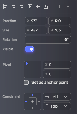
Some properties are shared in all UI elements.
| Property | Description |
|---|---|
| Align | The alignment style of the UI element. With it, you can quickly align the UI element left, horizontally center, right, top, vertically center, and bottom. |
| Position | The values on the X-axis and the Y-axis determine the position of the UI elements on the screen. |
| Size | Specifies the width and height of the UI element. |
| Rotation | Specifies the rotation of the UI element. |
| Visible | Determines if the UI element is visible. |
| Pivot | The pivot points of transformations. The value ranges from 0 to 1. For example, X = 0.5 and Y = 0.5 represent the center position. Click the point in the box to quickly set some commonly used values, such as center, bottom left corner, and bottom right corner. When you set the point as the anchor point, the origin position of the UI element will be set to the position of the pivot. By default, (0,0) of each UI element is in the top left corner. |
| Constraint | If Top and bottom or Left and right is not selected, Constraint defines the distances between the UI element's anchor point and the constraint points on the canvas. This distance will be applied to the distance between the anchor point and the screen points corresponding to the canvas point. If Top and bottom or Left and Right is selected, Constraint defines the distances between the vertices of the UI element box and constraint points. The distance will be applied to the distances between the vertices and the screen points corresponding to the canvas point. |
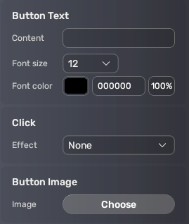
Button
| Property | Description | |
|---|---|---|
| Button text | You can specify the text to display on the button and set the font size, font color, and transparency for it. | |
| Content | The content of the text | |
| Font size | The font size of the text | |
| Font color | The font color of the text and the transparency | |
| Click effect | The effect to display when you click on the button | |
| Button image | The image to fill out the button |
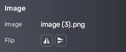
Image
| Property | Description |
|---|---|
| Image | The file name of the image |
| Flip | The way of flipping the image, either left-right or top-down. |
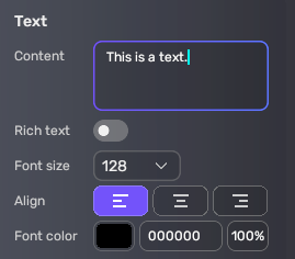
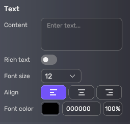
Text
| Property | Description |
|---|---|
| Content | The content of the text to display |
| Rich text | Determines if the displayed text is rich text. |
| Font size | The font size of the text |
| Align | The alignment style of the text |
| Font color | The font color of the text |
Shapes
Shapes offer basic shapes, including rectangles, ovals, triangles, and stars.
| Property | Description |
|---|---|
| Fill | The color to fill the shape and its transparency |

Text input
| Property | Description |
|---|---|
| Font size | The font size of the text |
| Font color | The font color of the text |
| Type | The type of the text input, either number, letter, or both. |
| Hint | A clue for players |
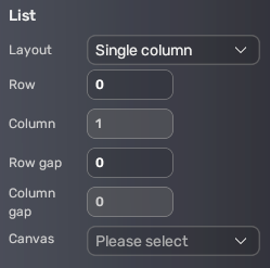
List
| Property | Description |
|---|---|
| Layout | The layout style of the list. Choose Single row if you want the list to be horizontal. Choose Single column if you want the list to be vertical. |
| Row | The number of rows |
| Column | The number of columns |
| Row gap | The distance between continuous rows |
| Column gap | The distance between continuous columns |
| Canvas | The canvas to fill in the list |
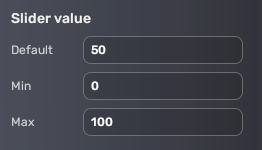
Slider
| Property | Description |
|---|---|
| Default | The default value |
| Min | The minimum value |
| Max | The maximum value |
Progress bar
| Property | Description |
|---|---|
| Default | The default progress |

Loader
| Property | Description |
|---|---|
| Canvas | The loader displays UI elements on another canvas. You can replace the selected canvas in Play mode using scripts. |


