Data elements
Data elements are the data that a creator can customize. You can add the data elements to Component in the Component Editor.
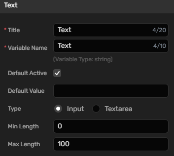
Text
| Property | Description |
|---|---|
| Title | The title of this field. 20 characters at most. |
| Variable Name | The name of the variable. It only consists of numbers and letters and can not start with a number. 10 characters at most. |
| Default Active | The default state of the Component. When selected, the default state is active. |
| Default Value | The default value of this field |
| Type | The type of the text input |
| Min Length | The minimum length of the text. |
| Max Length | The maximum length of the text. |
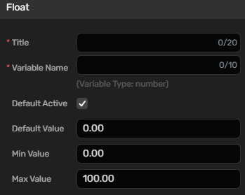
Float
| Property | Description |
|---|---|
| Title | The title of this field. 20 characters at most. |
| Variable Name | The name of the variable. It only consists of numbers and letters and can not start with a number. 10 characters at most. |
| Default Active | The default state of the Component. When selected, the default state is active. |
| Default Value | The default value of this field |
| Min Value | The minimum length of the text. |
| Max Value | The maximum length of the text. |
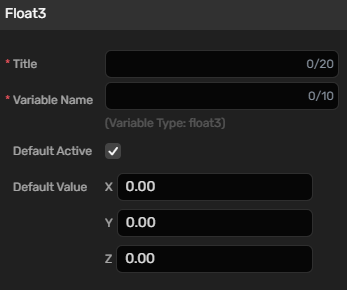
Float3
| Property | Description |
|---|---|
| Title | The title of this field. 20 characters at most. |
| Variable Name | The name of the variable. It only consists of numbers and letters and can not start with a number. 10 characters at most. |
| Default Active | The default state of the Component. When selected, the default state is active. |
| Default Value | The default value of this field |
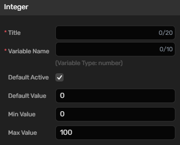
Integer
| Property | Description |
|---|---|
| Title | The title of this field. 20 characters at most. |
| Variable Name | The name of the variable. It only consists of numbers and letters and can not start with a number. 10 characters at most. |
| Default Active | The default state of the Component. When selected, the default state is active. |
| Default Value | The default value of this field |
| Min Value | The minimum length of the text. |
| Max Value | The maximum length of the text. |
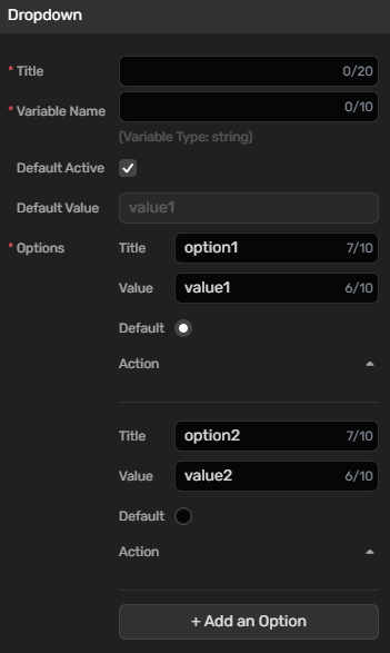
Dropdown
| Property | Description |
|---|---|
| Title | The title of this field. 20 characters at most. |
| Variable Name | The name of the variable. It only consists of numbers and letters and can not start with a number. 10 characters at most. |
| Default Active | The default state of the Component. When selected, the default state is active. |
| Options |
|
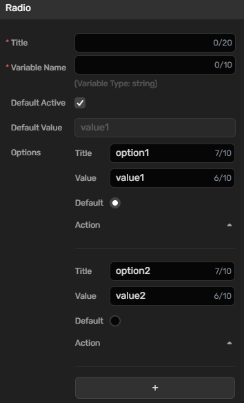
Radio
| Property | Description |
|---|---|
| Title | The title of this field. 20 characters at most. |
| Variable Name | The name of the variable. It only consists of numbers and letters and can not start with a number. 10 characters at most. |
| Default Active | The default state of the Component. When selected, the default state is active. |
| Default Value | The default value is the value you configure in Options. |
| Options |
|
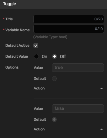
Toggle
| Property | Description |
|---|---|
| Title | The title of this field. 20 characters at most. |
| Variable Name | The name of the variable. It only consists of numbers and letters and can not start with a number. 10 characters at most. |
| Default Active | The default state of the Component. When selected, the default state is active. |
| Default Value | The value is off by default. |
| Options |
|
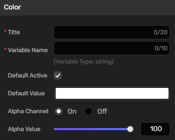
Color
| Property | Description |
|---|---|
| Title | The title of this field. 20 characters at most. |
| Variable Name | The name of the variable. It only consists of numbers and letters and can not start with a number. 10 characters at most. |
| Default Active | The default state of the Component. When selected, the default state is active. |
| Default Value | The default value is FFFFFF. |
| Alpha Channel | Determines whether to display alpha value. |
| Alpha Value | The alpha value specifies the transparency of the color. The default value is 100, which represents fully opaque. If you set it to 0, the color is fully transparent. |
